Facebook is freaking out a little about the Lake Highlands logo, but supporters and the volunteers who worked on it for years stand behind it.
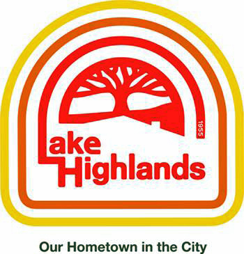
Earlier this week the Lake Highlands Branding Committee released the first-ever logo for Lake Highlands — a design featuring the colors of the sun and the tagline, “Our Hometown in the City.” We’ve known and have been telling readers for a few years now that this was in the works. Branding Lake Highlands is part of an effort to make our community more attractive to businesses and homebuyers, say branding committee members (including volunteers from the PTAs, Exchange Club, Women’s League and Public Improvement District).
Branding a community is about much more than a logo, but a logo is a significant and visible part of branding. When I spoke to Ben Jenkins, whose company One Fast Buffalo designed the Lake Highlands logo, he noted that unveiling of a brand is sensitive. Someone who was involved in the process should be around to answer questions and explain the research and strategy behind the logo.
My understanding is that this happened at this week’s PID meeting, where the logo was launched, although Jenkins was not involved, and it appears that it was well received at the time. (Note: Jenkins said he would like to have been available for the reveal and would have embraced an opportunity to explain and answer questions about the branding strategy).
However, when the logo was shared in different context on the Facebook group “You know you’re from Lake Highlands if …”, members of said group promptly began decrying the design.
Though the newly publicized design is an end product of several years of work and $18,000 garnered from fundraising events and private donations (this is significantly lower than what OFB normally would charge for research and development on similar projects) critics were quick to suggest disapproval and changes. Some were confused, wondering why we need a new logo when the old red and black interlocking LH is just fine or how the logo will look on football helmets (the logo represents the greater Lake Highlands community, not the high school). A few went so far as to break out the Microsoft Paint and create a “better” logo.
Some disliked it so much they created a Facebook group to “retract the logo.” Those suggest letting Lake Highlands students try their hand at a design.
But let’s go back to the part about: Branding a community is about much more than a logo, and neither an accountant with Microsoft Paint on his PC nor a high school student are going to have the expertise to properly brand a neighborhood (or city or business).
No matter how one feels about the aesthetic presentation, we must understand that there is strategy and nuance that goes into branding, so, just, no. Jenkins has been in the business 15 years. He’s branded cities, communities and businesses.
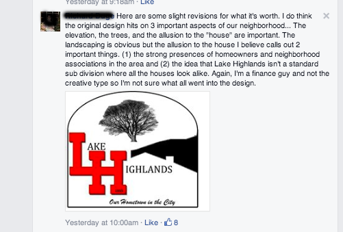
This commenter, “a finance guy” made quick work of the high school’s logo, turning it into what he thinks should replace the Lake Highlands logo. At least eight people thought it was a good idea.
The branding process is long and involved, and is similar whether for a company, neighborhood or a municipality, Jenkins notes.
The branding of Lake Highlands began years ago with research and online surveys.
Jenkins says he received thousands of responses to a questionnaire about people’s perceptions, hopes and expectations as they relate to Lake Highlands.
“We poured through all that data to find common denominators of how people identify Lake Highlands. I worked with a large committee that had representatives from just about every group you can be a part of if you want to join a group in Lake Highlands.”
Jenkins also had a vested interest, he says, because he is a lifelong Lake Highlands resident and a graduate of the high school.
Both committee member Ginger Greenberg, also a longtime resident and LHHS grad, and Jenkins noted, interestingly, that the recently revealed logo is the second iteration.
Branding committee members sent back the first concept that Ben’s team presented. (And no, I could not get a copy of what it looked like).
“We looked at it and showed it to a few (Lake Highlands residents outside the committee) and decided it didn’t work,” Greenberg says.
Jenkins says this is not unheard of, but for his company, due to the team’s painstaking research and strategizing, it is more common for clients to accept the first design submission.
While he did have to compromise, based on what the client (branding committee) wanted, he would have quit before producing a design he was not proud of; he stands behind his work.
He also says that, “If Lake Highlands was going to be branded, I wanted to be a part of that.”
The thing with a logo or any art, for that matter, is that some people are going to hate it. Especially if it is the least bit interesting. We run into the problem within the Advocate office when we are trying to design a cover. Usually there is someone who loves it, someone who hates it and someone who just wants to be done with it. So I cannot imagine trying to please a whole diverse community. It cannot be done, by the way.
Even Ben Jenkins tells me he knew, and he warned committee members that, “some people are going to hate this.” He says he read of a mayor in Arizona who quit over controversy surrounding the branding of a city.
What’s important, he notes, is that you have the research to back up your design and you stand behind it.
Since Jenkins turned the design over to the branding committee, he no longer is involved with anything that happens with the logo.
The Lake Highlands Public Improvement District (the nonprofit associated with the branding initiative) supports the research and work of the branding committee, executive director Kathy Stewart says.
“Last fall, the Lake Highlands PID Board was happy to welcome the Lake Highlands branding committee as a committee of the PID,” Stewart says. “The committee and the board share a common interest in developing an image that unifies and identifies Lake Highlands. Too many times we hear the question, ‘Now, where is Lake Highlands?’ Having a brand that encompasses who we are as a neighborhood and what makes us unique would help raise our profile. And maybe put us on the map, so to speak.”
Read more about the PID here.

