If you flipped through the print version of November’s magazine, you probably noticed that it looks, well, different. The section designs and fonts are updated, with the goal of giving readers more information while simultaneously giving the stories more room to breathe. Also, we’re hoping you saw quite a few invitations to visit our website. (Perhaps that’s how you ended up here.)
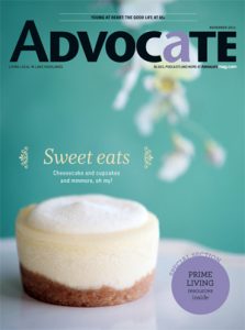 The last time we changed the look of the magazine was four and a half years ago, and much has changed since then — namely that we now have this robust, dynamic website with new stories, photos and videos added daily. If you’re reading only the print version of Advocate, you’re getting only a small portion of our neighborhood’s news. So we hope the more obvious, more colorful and more frequent mentions of website content will remind you to add us to your blog feeder, like us on Facebook, follow us on Twitter, subscribe to our weekly newsletter or even make us your home page.
With our new apps, You can also peruse our redesigned magazine on your mobile device, whether iPhone, iPad or Android. (For the best user experience, make sure to download the entire magazine before viewing.)
Is there still room for improvement? Definitely, and we hope you’ll give us feedback on what you see in the magazine and what else you’d like to see. Email us or comment below.
For those of you interested in things like font choices and specific section approaches, listen to this special podcast with art director Julianne Rice and editor Emily Toman, who were the driving forces behind the Advocate print magazine redesign. After the jump, we’ve excerpted a few of the highlights and provided the full audio version, which lasts roughly six minutes:
Art director Julianne Rice: “With everything competing for a reader’s attention, we wanted the photos to speak louder. We wanted to silence a lot of the clutter that was going on.
“We’ve also tried to point readers to the web a lot more, so you’ll notice in the use of color that we’re trying to indicate where the reader needs to go on the web and how they can get more out of their experience using Advocate magazine — that we’re not just a print magazine. You can’t watch a video on paper.”
Editor Emily Toman: “I feel like there’s more clarity to our content in terms of how you’re guided through the magazine. I think [the redesign] allows us to give readers a little bit more content despite the fact that we are focusing on playing up photos.
Something as simple as the events calendar — I think that we’re able to list more without it looking crowded or cluttered. Previously we’d listed only a few [events] on one page, and the new design, with the font choice and the placement of everything, has allowed us to include more events on one page, and it still looks clean.”

